By Arushi Kapoor, Founder, Art House Staging
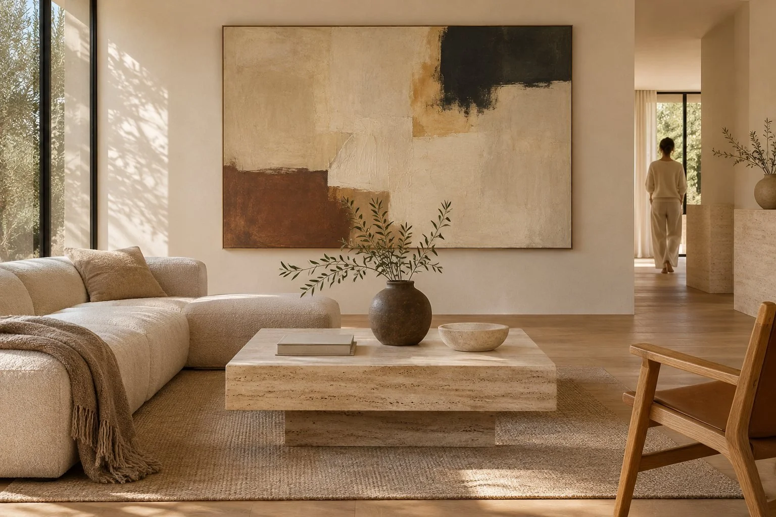
Warm minimalism works in a luxury listing when art gives a restrained room a clear focal point without adding visual clutter. Start with one well-scaled work in the room that matters most, then repeat a limited palette or material elsewhere only when it supports the architecture.
2026 staging commentary describes a move away from cool greys and stark white toward warmer palettes, with quiet luxury expressed through fewer, better-chosen pieces. That is a useful brief for art selection: make each placement intentional, and let the room's surfaces, light and proportions do their share of the work.
Key takeaways
Choose one focal artwork before adding smaller pieces to a warm minimalist room.
Let art relate to the room through scale, tone or material, not through a forced matching scheme.
Review placements from the doorway and in listing photographs before finalizing them.
Keep circulation, views and the architecture legible by editing pieces that compete.
What warm minimalism asks art to do
A pared-back room makes every object more visible. An artwork can create a point of attention, add a considered note of color and help a large wall feel resolved. It should not have to solve every problem at once. Begin by naming the room's role in the showing: is it the first impression, a place to gather, or a quiet transition? That answer helps establish whether the work should read as a focal piece, a supporting detail or a pause between more active rooms.
Warmth does not require a room full of warm-colored art. A pale composition can sit against oak and stone without disappearing if its scale and contrast are chosen carefully. A deep-toned work can supply one accent in a neutral interior, a direction specifically noted in the brief's 2026 staging commentary. Treat that as an option, not a formula. Look at the room in its actual light, then decide whether color, texture or open space in the artwork best balances the materials already present.
Choose a focal wall and set scale first
Walk the property from the entrance and mark the walls that naturally meet the eye. Usually one wall in the principal living area deserves a clear decision before secondary rooms are addressed. Measure that wall, note nearby furniture and record the strongest viewing positions. A broad empty wall may need a single large work to establish proportion; a narrower wall beside a doorway may benefit from a quieter piece. These are staging judgments, so use actual measurements and sightlines rather than a general rule about artwork size.
Make a paper or digital outline at the intended dimensions and assess it from the room entrance, the main seating position and the camera position planned for listing photographs. Check whether the artwork feels connected to the furniture below it, and whether the edges leave the room breathing space. If it dominates a doorway or competes with a window, adjust its location or scale. A visual mock-up is a low-cost way to make that decision before delivery and installation.
Build a restrained palette without matching everything
List the room's visible materials before choosing a work: stone, wood, metal, upholstery and paint. Then identify one relationship for the artwork to make. It might echo a warm undertone, introduce a single darker note, or create contrast against a quiet wall. Avoid demanding that the art repeat every finish. Exact coordination can flatten a room, while too many unrelated colors can make the focal wall feel accidental. A useful brief names the intended relationship in plain terms, such as a dark accent against pale stone.
Compare candidate works beside material samples or clear photographs of the room. View them at more than one distance, since a color that seems subtle close up can dominate across a large space. If a property includes several neutral rooms, vary the art's role instead of repeating the same composition everywhere. One room might carry the strongest accent; a connecting hall can use a calmer piece. That variation gives the home a sequence while respecting the quiet-luxury direction of fewer, better-chosen objects.
Edit supporting pieces and preserve movement
After placing the focal artwork, pause before filling every blank wall. Empty wall is part of the design and can help a room feel spacious. Add a secondary piece only when it clarifies a transition, balances a composition or gives a distinct room its own identity. Keep tabletops and ledges edited too; small objects below a large artwork can create a crowded band that weakens the main placement. In a walk-through, check the view from each doorway so no arrangement blocks a natural route or hides an architectural feature.
Use repetition selectively. A recurring frame tone or a related visual weight can connect rooms without making them feel identical. If several works appear in one sightline, compare their sizes and intensity together rather than approving each in isolation. Remove one piece if the group feels busy. For occupied homes, confirm which objects belong to the owner and which are being placed for staging; do not treat personal work as available to move without agreement. A written placement list keeps the edit clear to the agent and installation team.
Check the room under real viewing conditions
A placement that looks balanced in an empty room can change once lamps, furniture and window coverings are in place. Review it in daylight and with the lighting planned for an evening showing. Then view it from the positions a visitor is likely to occupy, including the entry and the main seating area. Make small adjustments only after checking the entire room. Moving one work can alter the balance among the furniture, a window and the next doorway, so assess the full composition again rather than judging the wall alone.
Photograph the room from the angles the listing team expects to use. Large art can make a focal point on an otherwise empty wall, a 2026 staging observation in the brief, but the photograph should still show the room's proportions and circulation. If the artwork reads as a flat dark patch, change the angle, placement or lighting plan. If it draws the eye away from the room's defining feature, reconsider whether it belongs there. Keep the photographed setup consistent with the property as visitors will encounter it.
Use a practical staging brief
Before installation, share a short room-by-room brief with the agent, property contact and staging team. Include the artwork's location, dimensions, mounting approach to be confirmed, intended palette, photograph angles and any access or handling constraints. Record who approves a move and who is responsible for the work during the listing period. This is especially useful when the home remains occupied or when a showing schedule leaves little time for discussion. Clear responsibilities prevent a last-minute adjustment from undoing an otherwise coherent plan.
The National Association of Realtors' Profile of Home Staging is a listed reference for the broader staging context, while the Art Basel and UBS Art Market Report provides market background rather than a prescription for room design. Use those sources for context and keep the choices tied to the actual property. For related practical guidance, see our articles on art for listing photography and choosing art for high ceilings. The goal is a warm, clear room where each artwork earns its place.
Common questions
How much art should a warm minimalist listing have?
Begin with one focal work in the main room, then add only pieces that help a distinct room or transition. Leave some walls quiet so the architecture and circulation remain clear.
Should art match the finishes in a luxury listing?
Art can relate to a finish through tone, contrast or material, but it does not need to repeat every surface. Compare the work with the actual room and choose one clear relationship.
How can an agent check art scale before installation?
Measure the wall and make a full-size paper or digital outline. Review it from the entrance, main seating position and planned listing-photo angle before arranging installation.
Sources
Art Basel: Art Basel and UBS Global Art Market Report 2026: Art Market Trends
Hospitality Net: 2026 Trends: The Future of Hospitality Design
Related reading
About the author
Arushi Kapoor is the founder of Art House Staging and The Agency Art House. Her team places gallery-quality art in luxury listings, model units and new developments for agents and developers in Los Angeles, Miami, New York and Seattle. She was named to the Forbes 30 Under 30 list in Art & Style.